
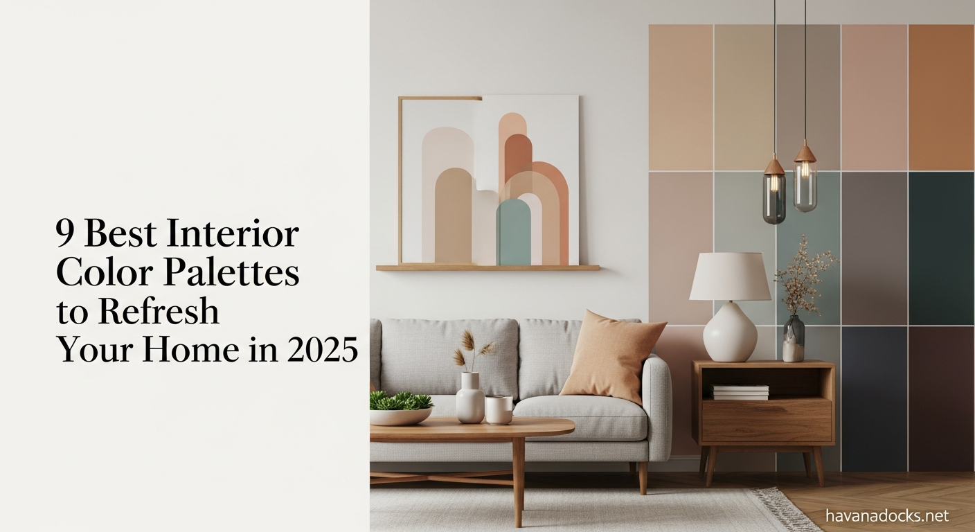
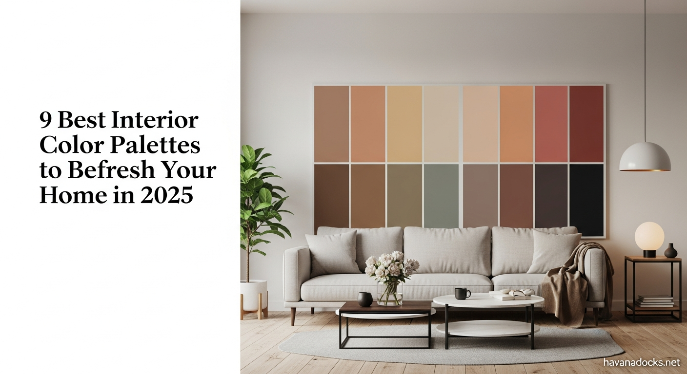
Unveiling the Top 9 Interior Color Palettes for 2025
9 Best Interior Color Palettes – This article delves into the nine best Interior Color Palettes 2025 that will redefine home aesthetics. We’ll explore the inspiration behind each palette, the mood they create, and how to effectively incorporate them into your home. From calming neutrals to bold and energetic hues, there’s a palette to suit every taste and style.
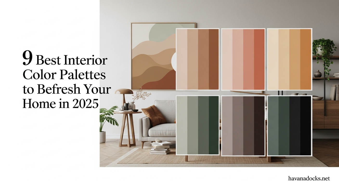
Palette 1: Earthy Oasis
This palette celebrates the raw beauty of nature, bringing the outdoors inside. Think warm browns, muted greens, and terracotta shades. It promotes a sense of grounding and tranquility, perfect for creating a serene retreat. This trend for Earthy Tones falls under the Interior Color Palettes 2025 must-haves.
Shades of the Earthy Oasis Palette
- Warm Terracotta: Evokes images of sun-baked landscapes, adding warmth and depth.
- Muted Sage Green: Brings a touch of nature’s tranquility into your home.
- Rich Chestnut Brown: Grounding and comforting, creating a sense of stability.
- Creamy Beige: Provides a neutral backdrop, allowing the other colors to shine.
- Stone Grey: Adds a touch of sophistication and balance.
Best Rooms for Earthy Oasis
Living rooms, bedrooms, and studies benefit most from this palette. Picture a living room with terracotta accent walls, a sage green sofa, and chestnut brown wooden furniture. In a bedroom, use creamy beige as the primary color with accents of terracotta and sage green for a calming atmosphere.
Styling Tips for Earthy Oasis
Incorporate natural materials like wood, stone, and linen to enhance the earthy feel. Add potted plants to further connect with nature. Consider textures like woven rugs and chunky knits for added warmth and comfort. Lighting also plays a key role, opt for warm, ambient lighting to create a cozy atmosphere.
Palette 2: Coastal Calm
Inspired by serene coastal landscapes, this palette features soft blues, sandy beiges, and crisp whites. It evokes a sense of relaxation and openness, perfect for creating a breezy and inviting atmosphere. It’s synonymous with Interior Color Palettes 2025 that breathe new life into spaces.
Shades of the Coastal Calm Palette
- Soft Sky Blue: Captures the essence of the open sky, creating a sense of serenity.
- Sandy Beige: Evokes the warmth and texture of the beach.
- Crisp White: Provides a clean and refreshing backdrop.
- Seafoam Green: Adds a touch of the ocean’s tranquility.
- Driftwood Grey: Offers a weathered and sophisticated touch.
Best Rooms for Coastal Calm
Bathrooms, bedrooms, and sunrooms thrive in this palette. Imagine a bathroom with soft sky blue walls, sandy beige tiles, and crisp white fixtures. In a bedroom, use a combination of soft blue and white linens for a tranquil retreat. A sunroom can be transformed into a relaxing oasis with wicker furniture and seafoam green accents.
Styling Tips for Coastal Calm
Incorporate natural textures like jute rugs, wicker furniture, and driftwood accents to enhance the coastal vibe. Add seashells and nautical-themed decor for a touch of personality. Maximize natural light and use sheer curtains to create a breezy atmosphere.
Palette 3: Bold & Energetic
This palette is all about making a statement. It features vibrant colors like teal, magenta, and sunshine yellow, creating a playful and dynamic atmosphere. Perfect for those who want to express their personality and embrace boldness. This showcases the vibrant side of Interior Color Palettes 2025.
Shades of the Bold & Energetic Palette
- Vibrant Teal: Adds a pop of energy and sophistication.
- Electric Magenta: Creates a sense of excitement and passion.
- Sunshine Yellow: Infuses the space with warmth and optimism.
- Graphite Grey: Provides a grounding contrast and balance.
- Bright White: Offers a clean and modern backdrop.
Best Rooms for Bold & Energetic
Home offices, game rooms, and creative spaces can benefit most from this palette. Picture a home office with teal accent walls, a magenta chair, and sunshine yellow accessories. In a game room, use bold colors to create a fun and stimulating environment.
Styling Tips for Bold & Energetic
Use color blocking techniques to create visual interest. Incorporate geometric patterns and modern art to complement the bold aesthetic. Choose furniture with clean lines and a minimalist design. Don’t be afraid to experiment with different textures and materials. Ensure the right lighting that complements the colors and does not overwhelm them.
Palette 4: Muted Pastels
This palette offers a softer, more subtle approach to color. Featuring shades like blush pink, lavender, and mint green, it creates a calming and romantic ambiance. This provides a sophisticated selection within the Interior Color Palettes 2025.
Shades of the Muted Pastels Palette
- Blush Pink: Adds a touch of femininity and warmth.
- Soft Lavender: Creates a sense of tranquility and relaxation.
- Mint Green: Infuses the space with freshness and serenity.
- Creamy White: Provides a soft and elegant backdrop.
- Light Grey: Offers a subtle contrast and balance.
Best Rooms for Muted Pastels
Bedrooms, nurseries, and dining rooms are ideal for this palette. Imagine a bedroom with blush pink walls, lavender linens, and mint green accents. In a nursery, use a combination of soft pastels to create a calming and nurturing environment.
Styling Tips for Muted Pastels
Incorporate soft textures like velvet and cashmere to enhance the romantic feel. Add floral accents and delicate patterns for a touch of elegance. Maintain a balance. Too much pastel can feel overwhelming.
Palette 5: Modern Monochrome
This palette embraces simplicity and sophistication with different shades of the same color. From deep charcoals to light greys, it creates a sleek and contemporary look. The elegant approach of the Interior Color Palettes 2025 is clearly visible.
Shades of the Modern Monochrome Palette
- Deep Charcoal: Creates a dramatic and grounding effect.
- Mid-Tone Grey: Adds depth and dimension.
- Light Grey: Brightens the space and provides a neutral backdrop.
- Off-White: Offers a softer alternative to pure white.
- Black Accents: Add contrast and definition.
Best Rooms for Modern Monochrome
Living rooms, home offices, and entryways thrive in this palette. Picture a living room with charcoal walls, light grey furniture, and black accents. In a home office, use different shades of grey to create a sophisticated and professional environment.
Styling Tips for Modern Monochrome
Focus on texture and material variations to add visual interest. Incorporate metallic accents like silver or gold for a touch of glamour. Use geometric patterns and minimalist art to complement the modern aesthetic.
Palette 6: Jewel Tones
Rich and luxurious, this palette features deep emerald green, sapphire blue, and amethyst purple. It brings a sense of opulence and drama to any space. This highlights the luxurious aspect of Interior Color Palettes 2025.
Shades of the Jewel Tones Palette
- Emerald Green: Evokes a sense of elegance and nature.
- Sapphire Blue: Adds a touch of royalty and sophistication.
- Amethyst Purple: Creates a sense of mystery and luxury.
- Gold Accents: Enhance the opulent feel.
- Neutral Grey: Provides a grounding contrast.
Best Rooms for Jewel Tones
Dining rooms, bedrooms, and libraries benefit most from this palette. Picture a dining room with emerald green walls, sapphire blue chairs, and gold accents. In a bedroom, use jewel-toned velvet fabrics for a luxurious and inviting atmosphere.
Styling Tips for Jewel Tones
Incorporate plush textiles like velvet and silk to enhance the opulent feel. Add ornate details like chandeliers and gilded mirrors. Balance the richness with neutral elements like grey walls and wooden furniture.
Palette 7: Retro Revival
Inspired by the vibrant colors of the 1970s, this palette features mustard yellow, avocado green, and burnt orange. It creates a nostalgic and playful atmosphere. This is your go-to for a vintage feel from the Interior Color Palettes 2025.
Shades of the Retro Revival Palette
- Mustard Yellow: Adds a pop of warmth and personality.
- Avocado Green: Evokes a sense of nostalgia and nature.
- Burnt Orange: Creates a cozy and inviting atmosphere.
- Creamy White: Provides a soft and neutral backdrop.
- Wood Tones: Enhance the retro vibe.
Best Rooms for Retro Revival
Living rooms, kitchens, and dining rooms are ideal for this palette. Imagine a living room with mustard yellow walls, avocado green furniture, and burnt orange accents. In a kitchen, use retro-inspired appliances and accessories to complete the look.
Styling Tips for Retro Revival
Incorporate vintage furniture and accessories to enhance the retro feel. Add shag rugs and geometric patterns for a touch of authenticity. Don’t be afraid to mix and match different textures and materials.
Palette 8: Biophilic Bliss
This palette is all about connecting with nature through color. It features various shades of green, from deep forest green to light olive green, creating a calming and rejuvenating atmosphere. This focuses on sustainability through the Interior Color Palettes 2025.
Shades of the Biophilic Bliss Palette
- Forest Green: Evokes the tranquility of a lush forest.
- Olive Green: Adds a touch of sophistication and warmth.
- Sage Green: Creates a sense of peace and serenity.
- Earthy Brown: Provides a grounding and natural element.
- Cream: Offers a soft and neutral backdrop.
Best Rooms for Biophilic Bliss
Bedrooms, living rooms, and home offices benefit greatly from this palette. Envision a bedroom with forest green walls, olive green linens, and natural wood furniture. In a home office, use various shades of green to create a calming and productive environment.
Styling Tips for Biophilic Bliss
Incorporate plenty of plants to enhance the connection with nature. Use natural materials like wood, bamboo, and linen. Maximize natural light and create a relaxing atmosphere with soft lighting. Think about features like water features or indoor fountains to enhance the biophilic effect.
Palette 9: Ethereal Dreamscape
This palette invokes a sense of peace and serenity through the use of light and airy colors. Featuring whites, creams, and palest grays alongside accents of silver and pearl, it brings a sense of calm and sophistication to any space. These pale tones showcase a minimalist option for the Interior Color Palettes 2025.
Shades of the Ethereal Dreamscape Palette
- Cloud White: A foundational color to establish a light and airy feel.
- Ivory Cream: Introduces subtle warmth and softens the overall look.
- Dove Gray: Provides a gentle contrast and depth, preventing the space from feeling too stark.
- Silver Accents: Offer a glamorous touch, reflecting light and adding shimmer.
- Pearl Undertones: Emphasize the ethereal quality, creating a serene and elegant ambiance.
Best Rooms for Ethereal Dreamscape
Bedrooms, bathrooms, and meditation or yoga rooms benefit tremendously from this delicate palette. Imagine a bedroom enveloped in soft white walls, coupled with ivory-cream bedding and subtle silver accents in the lighting fixtures or picture frames. In a bathroom, cool dove gray tiles can interplay beautifully with white vanities and pearl-toned accessories for a spa-like retreat.
Styling Tips for Ethereal Dreamscape
Focus should be given to textures. Soft, flowing fabrics such as linen or silk curtains can capture light beautifully, enhancing the overall ethereality. Mirrored surfaces and reflective materials amplify natural light and add dimension. When integrating furniture, go for sleek, minimalist styles with rounded edges to mirror the soothing, flowing aesthetic. Avoid sharp, angular designs that could offset the room’s intended tranquility.
Incorporating Interior Color Palettes 2025 into Your Home
Choosing the right Interior Color Palettes 2025 is just the first step. Here are some tips on how to effectively incorporate them into your home:
- Start with a neutral base: Use neutral colors like white, grey, or beige for walls and large furniture pieces.
- Add pops of color: Incorporate accent colors through accessories, artwork, and smaller furniture items.
- Consider the room’s function: Choose colors that are appropriate for the room’s purpose. Calming colors for bedrooms, energetic colors for home offices, and so on.
- Balance warm and cool tones: Mix warm and cool colors to create a harmonious and balanced space.
- Don’t be afraid to experiment: Try out different color combinations and see what works best for your personal style.
Understanding Color Psychology for Interior Design
Color psychology plays a vital role in interior design. Different colors evoke different emotions and can influence our mood and behavior. Understanding these psychological effects can help you create spaces that are both beautiful and functional. Considering the effect paints can have showcases the versatility of Interior Color Palettes 2025.
Warm Colors
Warm colors like red, orange, and yellow are associated with energy, passion, and excitement. They can create a lively and stimulating atmosphere. However, they can also be overwhelming if used in excess.
Cool Colors
Cool colors like blue, green, and purple are associated with calmness, tranquility, and peace. They can create a relaxing and soothing atmosphere. However, they can also feel cold and impersonal if not balanced with warm tones.
Neutral Colors
Neutral colors like white, grey, beige, and brown provide a versatile backdrop for other colors. They can create a sense of balance and harmony. They are often used as a base color and can be combined with both warm and cool tones.
The Importance of Lighting in Interior Design
Lighting plays a crucial role in interior design. It can affect the way colors are perceived and can dramatically change the mood of a room. Here are some tips on how to use lighting effectively:
Natural Light
Maximize natural light whenever possible. It is the best source of light and can make a room feel brighter and more inviting. Keep windows clean and avoid heavy curtains that block out sunlight.
Artificial Light
Use a combination of different types of artificial light, including ambient lighting, task lighting, and accent lighting. Ambient lighting provides overall illumination, task lighting provides focused light for specific activities, and accent lighting highlights specific features.
Color Temperature
Consider the color temperature of your light bulbs. Warm light (2700-3000K) creates a cozy and inviting atmosphere, while cool light (4000-5000K) creates a brighter and more energizing atmosphere.
The Role of Texture in Interior Design
Texture refers to the surface quality of materials, and it can play a significant role in adding depth, visual interest, and tactile appeal to any space designed with Interior Color Palettes 2025. By carefully selecting and layering different textures, you can create an environment that is more inviting and engaging.
Types of Textures
There are two main types of textures: visual texture and tactile texture.
Visual Texture
Visual texture refers to the appearance of texture, even though the surface may be smooth to the touch. It is created through patterns, colors, and light. Examples of visual texture include patterned wallpaper, faux finishes, and painted textures.
Tactile Texture
Tactile texture refers to the actual feel of a surface. It can be rough, smooth, soft, or hard. Examples of tactile textures include woven fabrics, natural wood, and stone.
Incorporating Texture into Your Design
When incorporating texture into your interior design when considering Interior Color Palettes 2025, consider the following tips:
- Mix and Match: Combine different textures to create visual interest. For example, pair a smooth leather sofa with a chunky knit throw.
- Consider the Room’s Function: Choose textures that are appropriate for the room’s purpose. For example, use soft and plush textures in bedrooms and more durable textures in high-traffic areas.
- Use Texture to Add Warmth: Incorporate warm textures like wood, wool, and velvet to create a cozy and inviting atmosphere.
- Use Texture to Add Contrast: Use contrasting textures to create visual excitement. For example, pair a sleek glass table with a rough stone wall.
- Layer Textures: Layer different textures to add depth and dimension. For example, layer a rug over a hard floor and add cushions and throws to a sofa.
Examples of Texture in Interior Design
Living Room: In a living room, you could incorporate texture through elements such as a plush velvet sofa, a woven jute rug, and textured throw pillows. Use a rough-hewn coffee table or exposed brick wall to add ruggedness.
Bedroom: For a more tranquil and comfortable bedroom, you might have soft linen bedding, a cozy faux fur throw, and smooth silk curtains. Adding a tufted headboard or a shag pile carpet can further enhance the textural landscape of the room.
Bathroom: In bathrooms, consider materials that combine functionality with appeal. Textured tiles like subway or herringbone are classics that provide easy maintenance. Rough stone accents and soft, absorbent towels provide another layer of texture contrast within the bathroom space as well.
Incorporating varying textures into your design when focusing on Interior Color Palettes 2025, allows you to build deeper sensory experiences within the home atmosphere, thereby boosting the room’s visual appeal paired alongside the perfect coloring.
Sustainable Interior Design Practices and Color Choices
As awareness of environmental issues grows, sustainable interior design is becoming increasingly important. It focuses on minimizing the environmental impact of your home decor choices. Here’s how to incorporate sustainable practices into your color choices and overall design, mindful of Interior Color Palettes 2025:
Choosing Eco-Friendly Paints
Conventional paints often contain volatile organic compounds (VOCs), which are harmful to both the environment and your health. Opt for low-VOC or no-VOC paints, natural paints, or recycled paints.
Low-VOC and No-VOC Paints
These paints contain significantly lower levels of VOCs than traditional paints, making them healthier for indoor air quality.
Natural Paints
Made from natural ingredients like clay, milk casein, and natural pigments, these paints are biodegradable and non-toxic.
Recycled Paints
Some companies recycle leftover paint and create new paints from salvaged materials.
Using Sustainable Materials
When choosing furniture, flooring, and other decor items, opt for sustainable materials.
Reclaimed Wood
Using reclaimed wood reduces the demand for new timber and gives old wood a second life.
Bamboo
Bamboo is a fast-growing, renewable resource that is perfect for flooring, furniture, and accessories.
Recycled Materials
Look for products made from recycled materials, such as glass, plastic, and metal.
Reducing Waste
Minimize waste by buying only what you need, repurposing old items, and donating or recycling unwanted items.
Upcycling
Give old furniture and accessories a new lease on life by repainting, reupholstering, or repurposing them.
Secondhand Shopping
Shop at thrift stores and flea markets to find unique and affordable furniture and decor items. Buying from these second hand venues can give you a good base to begin painting when aligning with Interior Color Palettes 2025.
The Impact of Cultural Trends on Interior Color Palettes
Cultural trends play a significant role in shaping Interior Color Palettes 2025. The colors we choose for our homes often reflect the broader cultural landscape, including fashion, art, and social movements.
Influence of Fashion
Fashion trends often trickle down into interior design. Colors that are popular on runways and in clothing stores tend to influence the colors we choose for our homes. For example, if bold and vibrant colors are trending in fashion, we may see more of these colors in interior design as well. Bold colors are certainly an option with the Interior Color Palettes 2025.
Role of Art
Art movements also have a significant impact on interior color choices. From the bright and bold colors of pop art to the muted and earthy tones of minimalism, art can inspire and influence our aesthetic preferences.
Social and Political Influences
Social and political events can also shape the colors we choose for our homes. For example, during times of economic uncertainty, we may gravitate towards calming and grounding colors. On the other hand, during times of optimism and excitement, we may embrace bolder and more vibrant colors.
Examples of Cultural Trends Influencing Color Choices
- Minimalism: The minimalist movement, with its focus on simplicity and functionality, has led to the popularity of neutral colors like white, grey, and beige.
- Bohemian Style: The bohemian style, with its emphasis on eclectic and natural elements, has brought about the resurgence of earthy tones, jewel tones, and rich textures.
- Modern Farmhouse: The modern farmhouse style, with its blend of rustic and contemporary elements, has popularized the use of white, grey, and natural wood tones.
Future Trends in Interior Color Palettes
Looking ahead, several emerging trends are set to influence Interior Color Palettes 2025.
Tech-Inspired Colors
As technology becomes increasingly integrated into our lives, we may see more tech-inspired colors in interior design. Think cool blues, metallic silvers, and futuristic neons.
Global Influences
Globalization will continue to influence interior design, bringing in colors and patterns from different cultures around the world.
Personalized Palettes
More and more people are embracing individuality and creating personalized color palettes that reflect their unique personalities and lifestyles.
Choosing the Right Palette for Your Personal Style
Ultimately, the best Interior Color Palettes 2025 for you will depend on your personal style and preferences. Here are some tips for choosing the right palette:
- Consider your existing furniture and decor: Choose colors that complement your existing furniture and decor.
- Think about the mood you want to create: Choose colors that evoke the desired mood and atmosphere.
- Start with a color you love: Choose a color that you love and build your palette around it.
- Test colors before committing: Paint samples on your walls and observe them in different lighting conditions.
- Don’t be afraid to break the rules: Trust your instincts and create a palette that is uniquely yours.
Conclusion
The Interior Color Palettes 2025 offer a diverse range of options to refresh and revitalize your living spaces. Whether you’re drawn to the calming embrace of Earthy Oasis, the vibrant energy of Bold & Energetic, or the serene elegance of Muted Pastels, there’s a palette to ignite your inspiration. By understanding the psychology of color, considering sustainable practices, and embracing cultural influences, you can curate a home that reflects your unique style and creates a welcoming haven for years to come.